Tinge: Every Shade of Skin
Project 07

Tinge: Every Shade of Skin


Participants
  • Creative Direction Jong Woo Si
  • Art Direction Jong Woo Si
  • Photo Art Direction Jong Woo Si, Michelle Deng

Project Overview

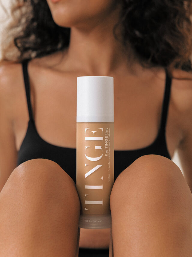
Tinge is a beauty brand built around a simple but powerful idea: every skin tone deserves to be seen. Its full-body skin tint was created to provide women of every shade with a safe and effective foundation solution beyond the face.

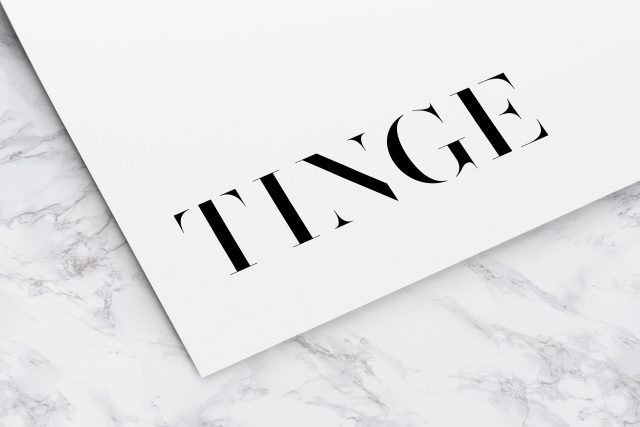
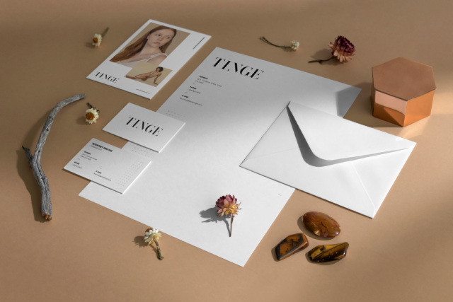
JD&Co. Creative worked closely with the founder from the early stages of the company to translate her vision into a distinctive and inclusive brand identity. We developed the Tinge visual identity, packaging, and brand collateral, creating a system centered on the beauty and individuality of diverse skin tones.

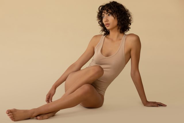
The visual language draws inspiration from the rich spectrum of human skin, using warm tonal variations, tactile imagery, and photography that celebrates the body in its natural form. Product imagery and skin-focused photography work together to communicate Tinge’s core idea: beauty is not defined by a single shade.

* Some images featured in this case study are sourced from Tinge’s official Instagram account. All image copyrights remain with Tinge and/or their respective copyright holders. Unauthorized reproduction, redistribution, or commercial use is strictly prohibited.


Keywords

Share This

Tinge: Every Shade of Skin
Stationery Design
Tinge: Every Shade of Skin
TINGE BOTTLE
Tinge: Every Shade of Skin
Photo Art Direction
Tinge: Every Shade of Skin
Photo Art Direction

Services

  • Brand Identity
  • Brand Style Guide
  • Stationery Design
  • Packaging
  • Art Direction


Case Studies

Email