The Challenge
Hazelicious had quite the nut to crack. As the new kid in the milk and nut butter aisles, their goal was to stand out from their dairy and plant-based counterparts. They also wanted customers to know that switching to Hazelicious comes with plenty of yummy and environmentally-friendly perks.
The Solution
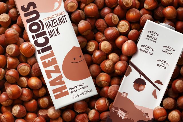
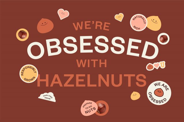
Because Hazelicious positioned themselves as the go-to for hazelnut products, JD&Co. similarly zeroed in on this unique nut, making it the hero of all its creative. Inspired by the “chunky” variety native to the founders’ ancestral home in Giresun, Turkey, we created a smiley, cheeky mascot that beckons the user to pour a glass (or grab a spoonful butter).
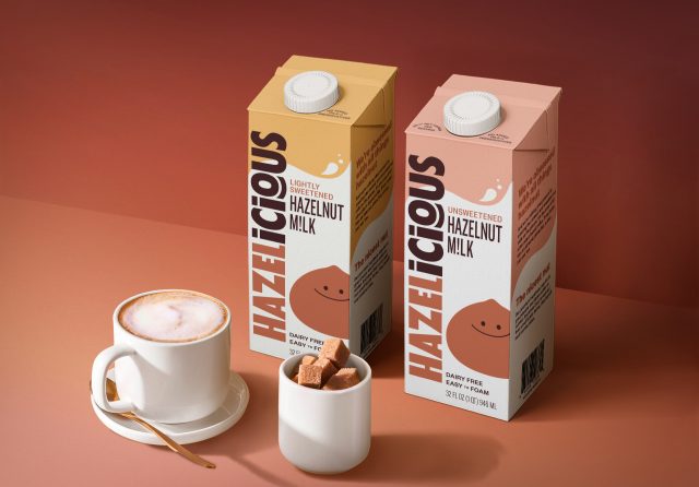
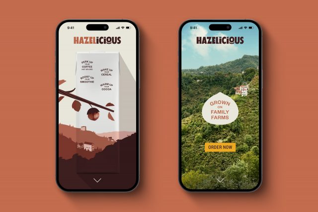
From there we fleshed out the full brand system, creating logos and color palettes, plus packaging that was appetizing, inviting, and included all the benefits of eating and drinking Hazelicious products.
The Results
Now, Hazelicious has ownable branding and packaging to help ensure customers reach for these tasty, hazelnut-filled products time and time again. Consider the nut cracked!
Services
- Branding
- Illustration
- Packaging
Case Studies
Case Studies

