The LOGOTYPE
The logotype was meticulously customized for 33 Hotel. Every detail is carefully considered: the stroke weights remain consistent, the serifs are precisely rounded, and the spacing is finely calibrated. This precision reflects the brand’s commitment to clarity and leaves a sharp, lasting impression across all touchpoints.
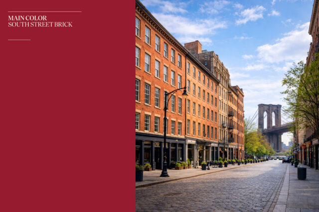
The COLOR
Color is one of the most essential elements of the brand identity system. As one of the first elements guests encounter, it helps define the hotel’s character. Inspired by the hotel façade and the iconic brick buildings of South Street Seaport, South Street Brick reflects the architectural heritage of the area while reinforcing the hotel’s distinctive identity.
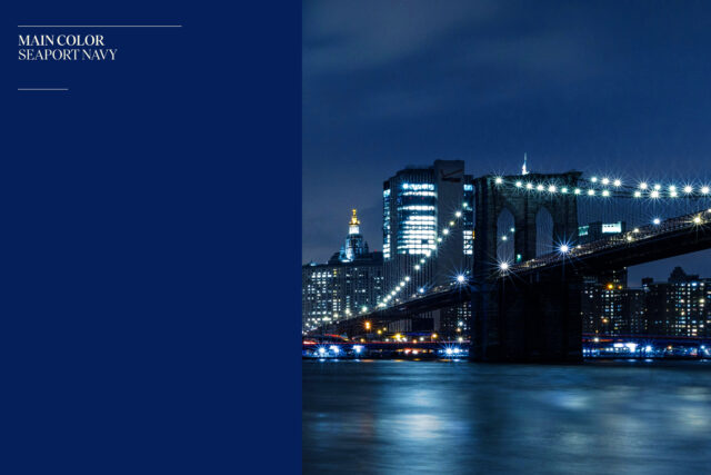
NYC’s night view along the Hudson River and Seaport offers an unforgettable experience. The deep navy in our palette, Seaport Navy, draws inspiration from the reflective night sky over the water. It captures the calm atmosphere of the waterfront and evokes a memorable sense of place for guests at 33 Hotel.
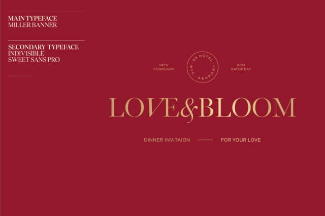
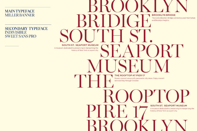
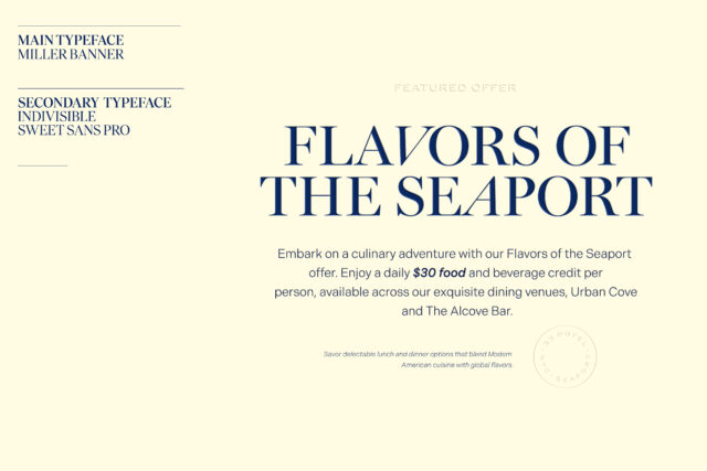
The TYPEFACES
The typeface is a key element of the brand identity system and one of the first points of engagement. It must remain highly legible while subtly expressing the refined quality of 33 Hotel’s service. Miller Banner brings a sense of luxury and modern elegance through its sophisticated details. Indivisible ensures clarity and readability, maintaining sharp glyphs and numerals even at smaller sizes while harmonizing with Miller Banner. Sweet Sans Pro functions as the accent typeface, adding a refined and elegant tone through its extended proportions and distinctive stroke contrast.
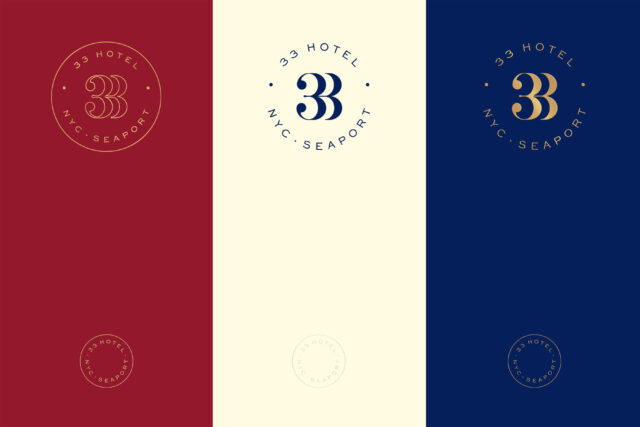
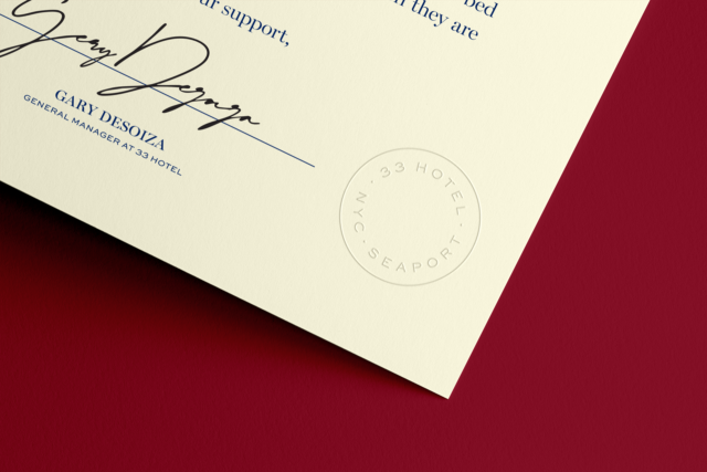
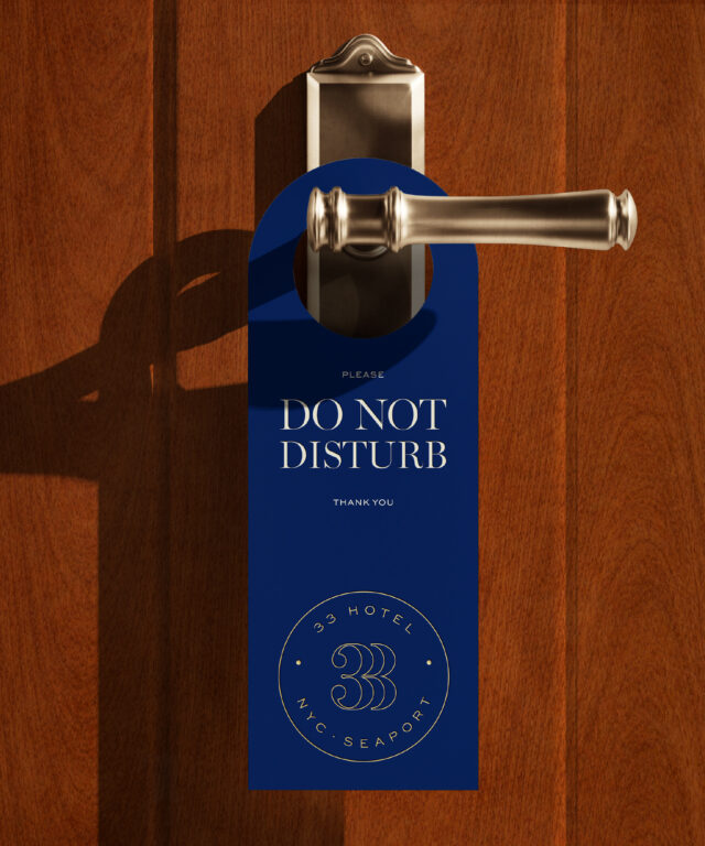
The SEAL & MEDALLIONS
The medallions are alternate expressions of the identity that can stand independently to represent 33 Hotel. They are primarily used for event graphics, souvenirs, and other special applications, conveying the brand with a refined and elegant presence. The seal can be applied to the back of collateral pieces or as a subtle corner detail on the front, adding a discreet and sophisticated finishing touch.
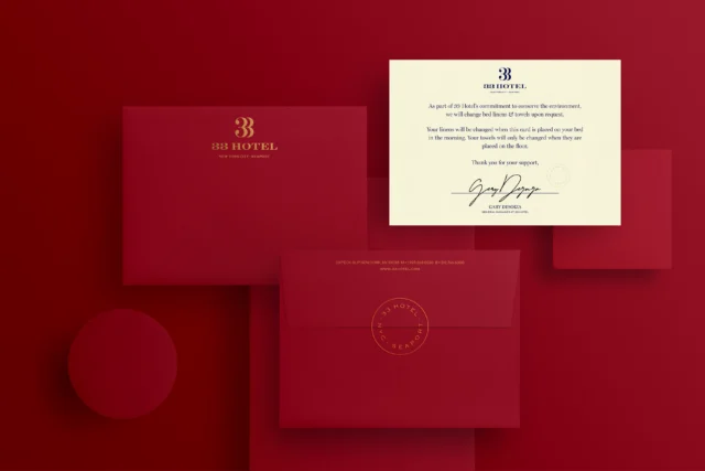
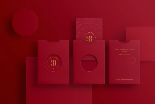
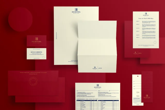
The KEY COLLATERALS
The key collateral pieces were crafted using refined printing techniques, with papers and finishes selected in close collaboration with skilled vendors to maintain a high level of quality within budget constraints. The keycard and sleeve were designed as a unified system, where the medallion aligns precisely with the circular die-cut, allowing the two elements to complete the composition together.
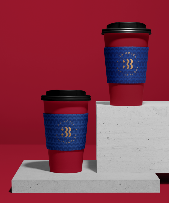
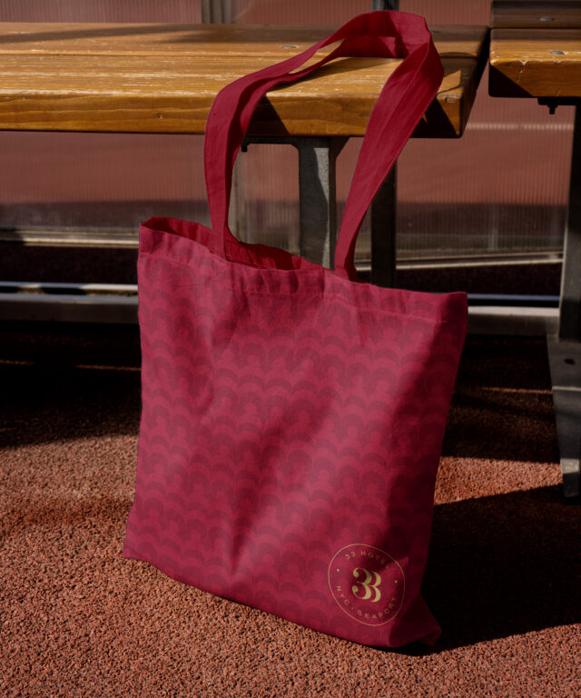
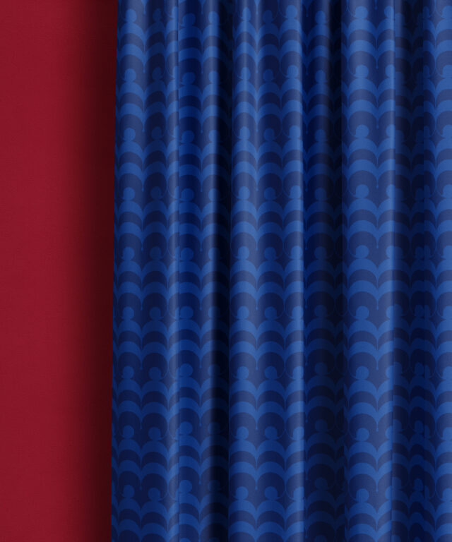
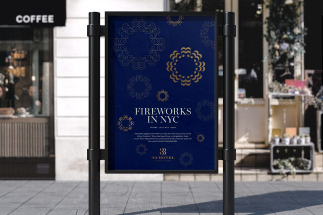
The PATTERN
The symbol is inspired by an open-winged ladybug and designed as a distinctive, ownable form with strong potential for pattern development. Compared to the previous, more organic version, this refined shape enables a wider range of structured patterns beyond simple horizontal or vertical repetition. The base unit is carefully constructed for balance and symmetry, with consistent proportions and perfectly circular dots, allowing the symbol to transform into playful yet well-organized patterns across various collateral applications.
Because the units follow precise geometric rules—combining square structures with circles and ovals—they generate visually engaging and highly structured compositions. By applying rotations, flips, and repetition based on the unit’s exact proportions, the system produces a variety of patterns while maintaining the clarity and character of the original symbol.
SERVICES
- Art Direction
- Brand Identity system
- Collateral Design
- Digital
- Print Production
- Editorial Design
- Illustration
- Promotional design
- Web design